From science to webdesign
The Creative Path of Sander Martens
You may already have noticed: the National Knowledge Network Psychiatry and Giftedness has a new look. Website, logo, newsletter—everything suddenly looked different in December. We are incredibly proud of this beautiful design, and of the designer, Sander Martens, who was willing to invest his time in it—partly on a voluntary basis. This inspiring man deserves a proper introduction. Board member Marije van Beilen gives him a call.

Sander Martens
Hi Sander. You designed our new logo and website. We asked for a burgundy-colored website, but that’s not what we got! Can you explain? 🙂
“That’s true,” Sander laughs. “I went looking for a color palette that would be more fitting for this subject. You indicated that you liked burgundy, but you also wanted a businesslike, professional, and clean design aimed at mental health professionals. The colors I chose now are a mix that allows for plenty of color throughout the website without it becoming too busy. It’s clean and conveys trust. No burgundy, which tends to be associated more with casinos, wine merchants, or real estate offices.”
We asked for a website aimed at gifted people: playful, with movement and connection. How did you translate that into your design?
“The website needed to convey expertise, but also spark curiosity. There is a lot of movement built into the site, guiding visitors through it in a natural way. In my former work as a cognitive neuroscientist, I spent a lot of time thinking about how attention is captured and how it can be sustained. I bring that knowledge into my current work as a photographer, artist, and web designer. How do you create imagery that draws attention? What message do you want to convey? What are distracting factors?”
Cognitive neuroscientist! Yes, of course—I knew that. We used to be colleagues at the University of Groningen. Attention is a broad concept that appears in many psychological and cognitive disciplines. Could you explain what you mean by ‘attention’?
“I studied individual differences in selective attention: how quickly people take in information and how quickly they can then shift their attention to something new. Regardless of intelligence or education level, people differ greatly in this respect. We tracked these differences and changes in attention using EEG and pupil size measurements—a measure of mental effort.”

The colour palet of the new website
That’s a wonderful combination of knowledge: visual perception and attention, combined with the creativity of an artist! How do we see this reflected in our website?
“It may sound like a big leap—from scientist to artist—but both worlds have shaped who I am today. Publishing in Nature or giving lectures at Harvard and Cambridge taught me how to communicate complex ideas clearly and visually.
What was distinctive about this assignment was the enormous amount of information you had already created in the first years of the LKPHB foundation. Your existing body of knowledge, along with news and updates about upcoming events—such as webinars—forms the core of what you do. For me, the challenge was to reduce this to a clear and accessible structure for website visitors. Visitors shouldn’t get lost. Three buttons on the new website—‘news’, ‘offerings’, and ‘contact’—allow users to quickly access the most important information. It has become a coherent and well-balanced whole.”
In addition to the website, you also designed a beautiful new logo for us—essentially as volunteer work. I imagine giftedness is not an unfamiliar theme for you. Do you have a personal connection to the target group?
“Yes, I’ve encountered giftedness quite often in my personal environment. And psychological issues as well. For example, in primary school I had a classmate who struggled deeply with loneliness due to being gifted. That’s why this assignment immediately resonated with me.
We started with the logo. Initially, we worked with multiple letters—LKPHB—but gradually reduced this to the three letters P, H, and B. That made it easier to create something visual. I ended up combining the letters in a way that also refers to a spatial element from an intelligence test. In my scientific research, I previously worked with Raven’s Progressive Matrices.”
Ah—so were you also a practitioner, administering IQ tests? You’ve had quite a versatile career!
“No, I was never a practitioner. I studied Psychology and Artificial Intelligence in Tilburg and Nijmegen, graduated with an internship in Cambridge, and then completed my PhD in Leiden. While in Cambridge, I bought my first camera—thirty years ago.
I originally wanted to become a professor, but with the ongoing budget cuts in higher education, that prospect became increasingly unlikely. Alongside my full-time job, I started my own photography business eleven years ago. For the past two years, I’ve been working full-time as a photographer and web designer. It was a very exciting step to take, but I haven’t regretted it for a moment.
My network now includes not only scientists and medical professionals, but also many artists—for whom I regularly design websites. I do a lot of portrait photography, including PhD defenses, as well as architecture and product photography. I give workshops and sell artistic work through galleries and my own website (www.sandermartens.com).


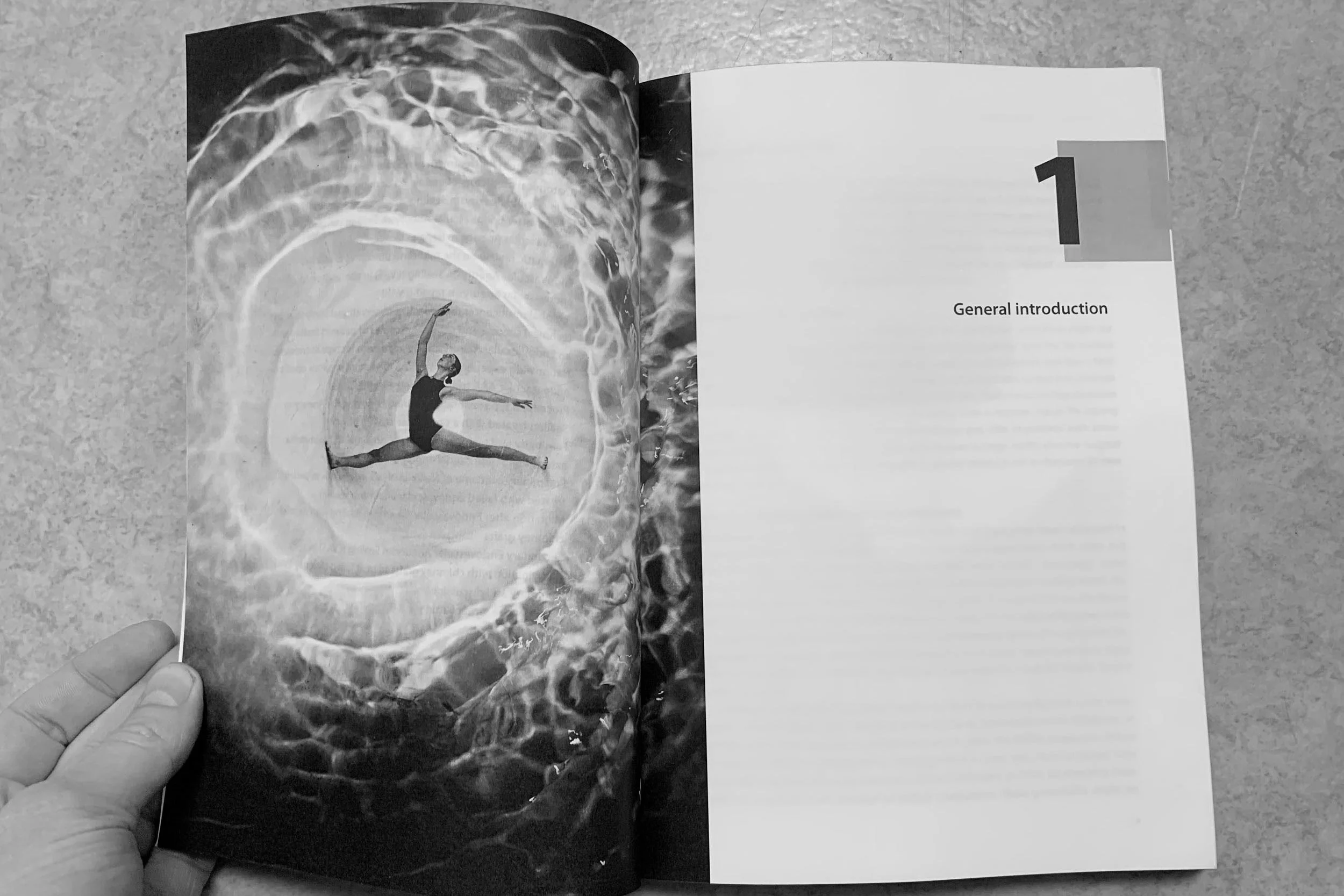
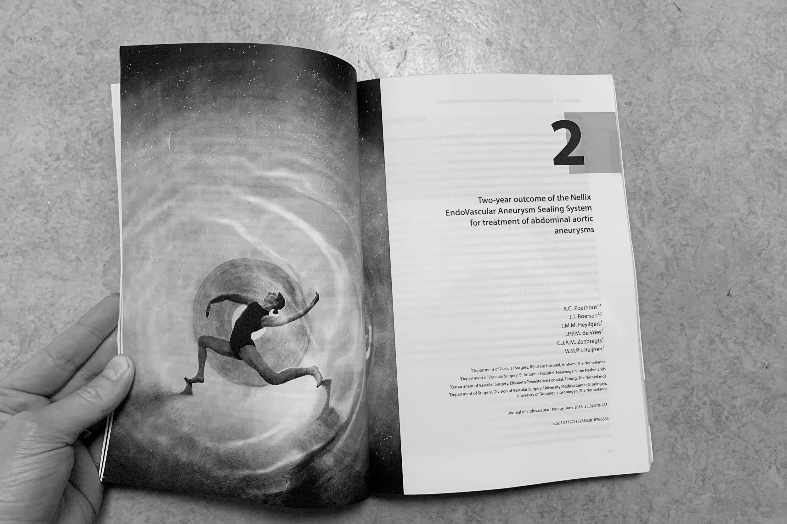
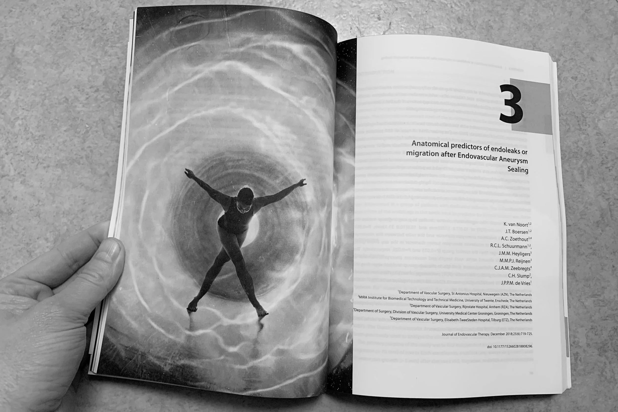


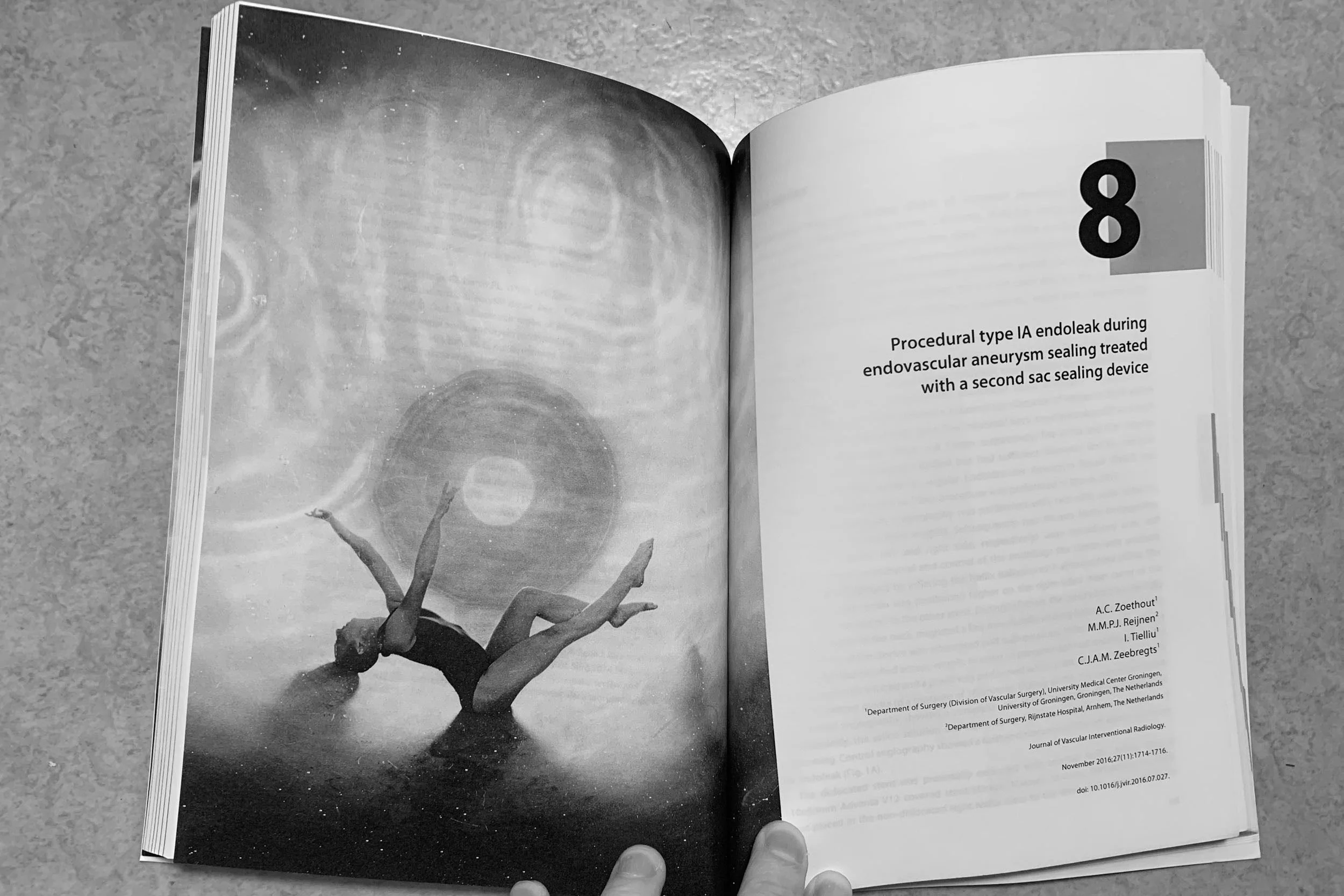
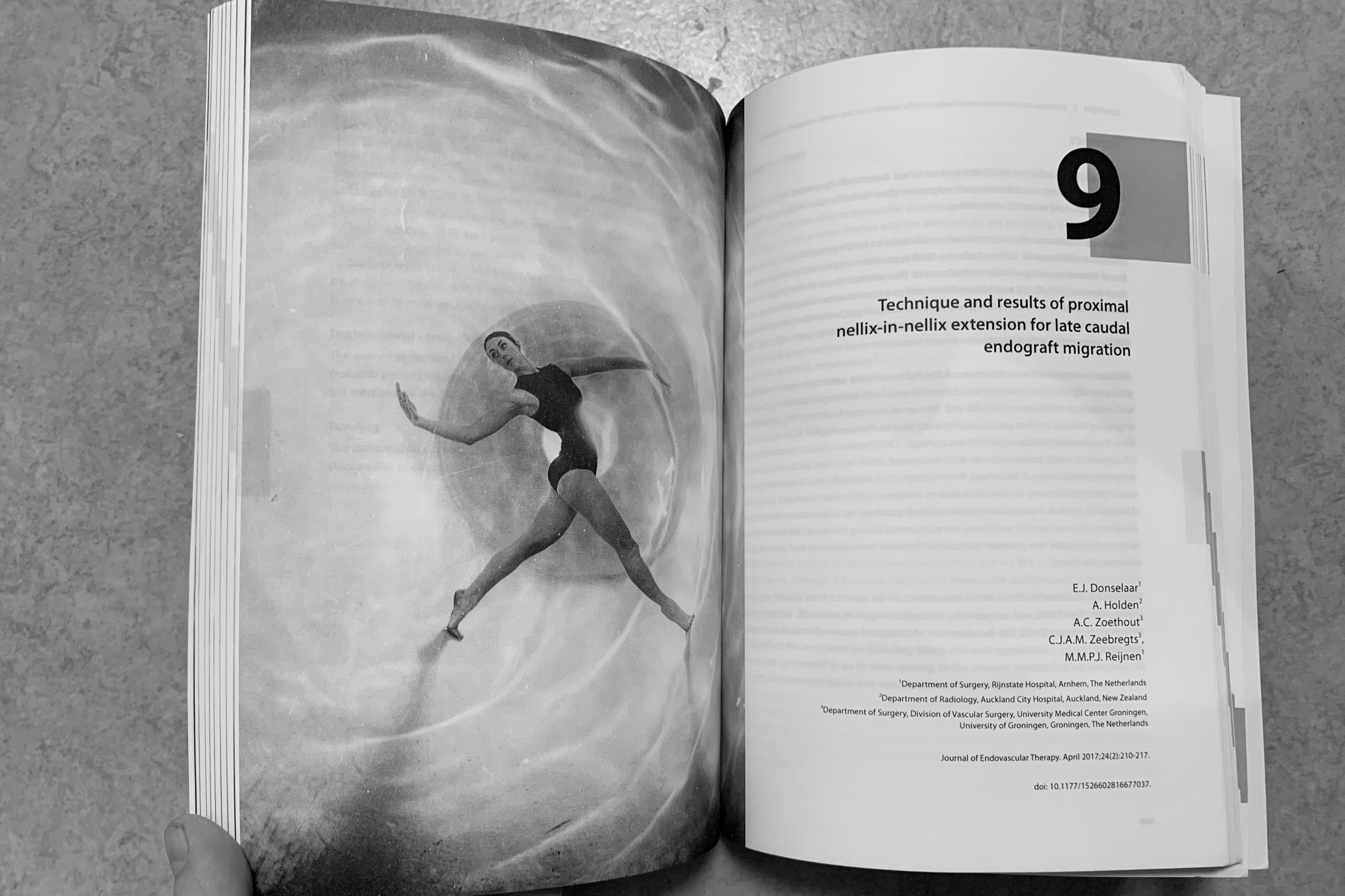
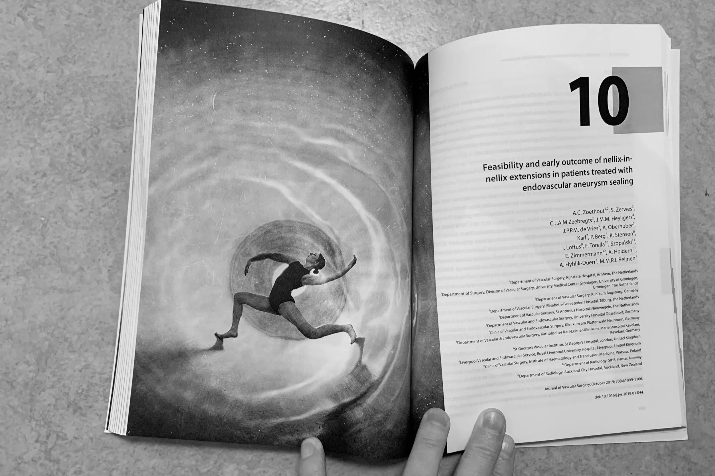
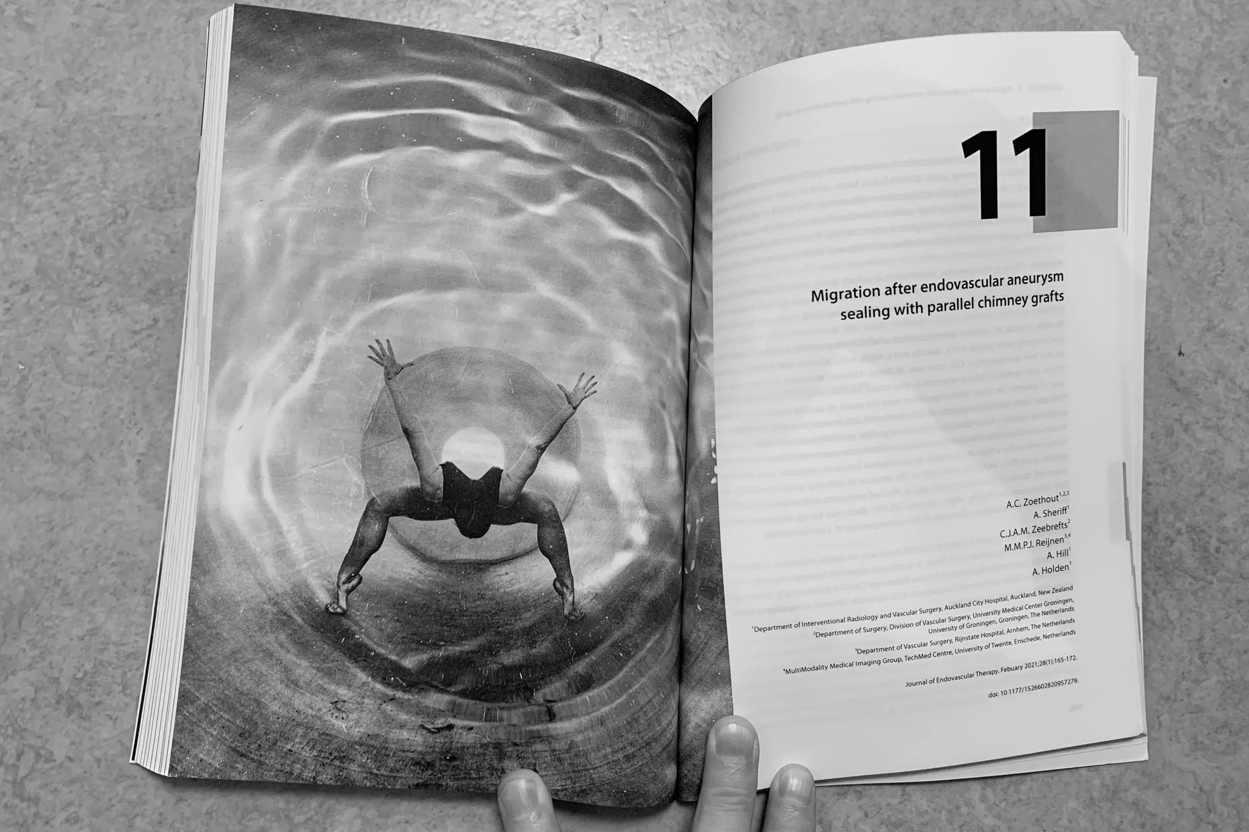
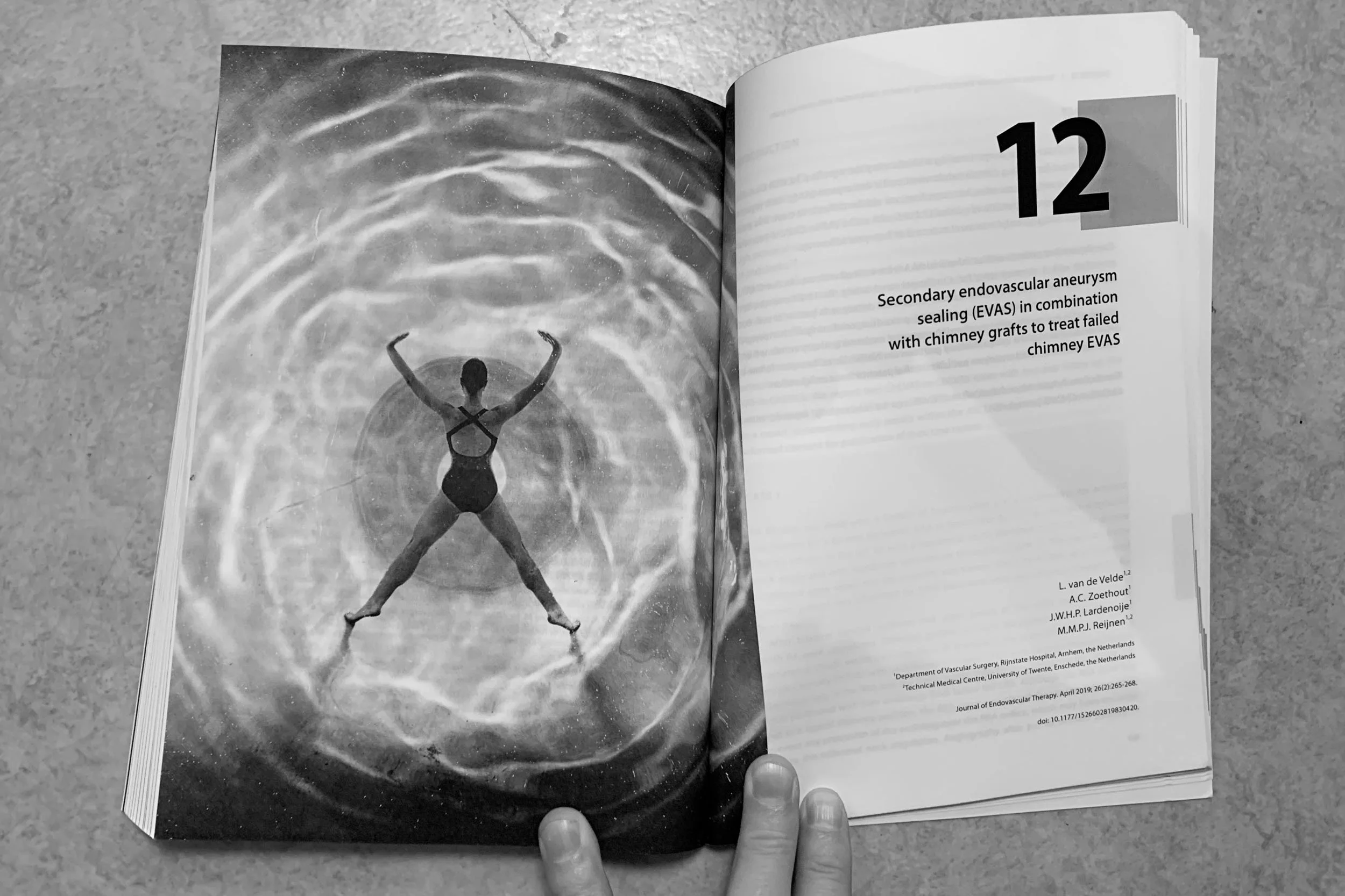

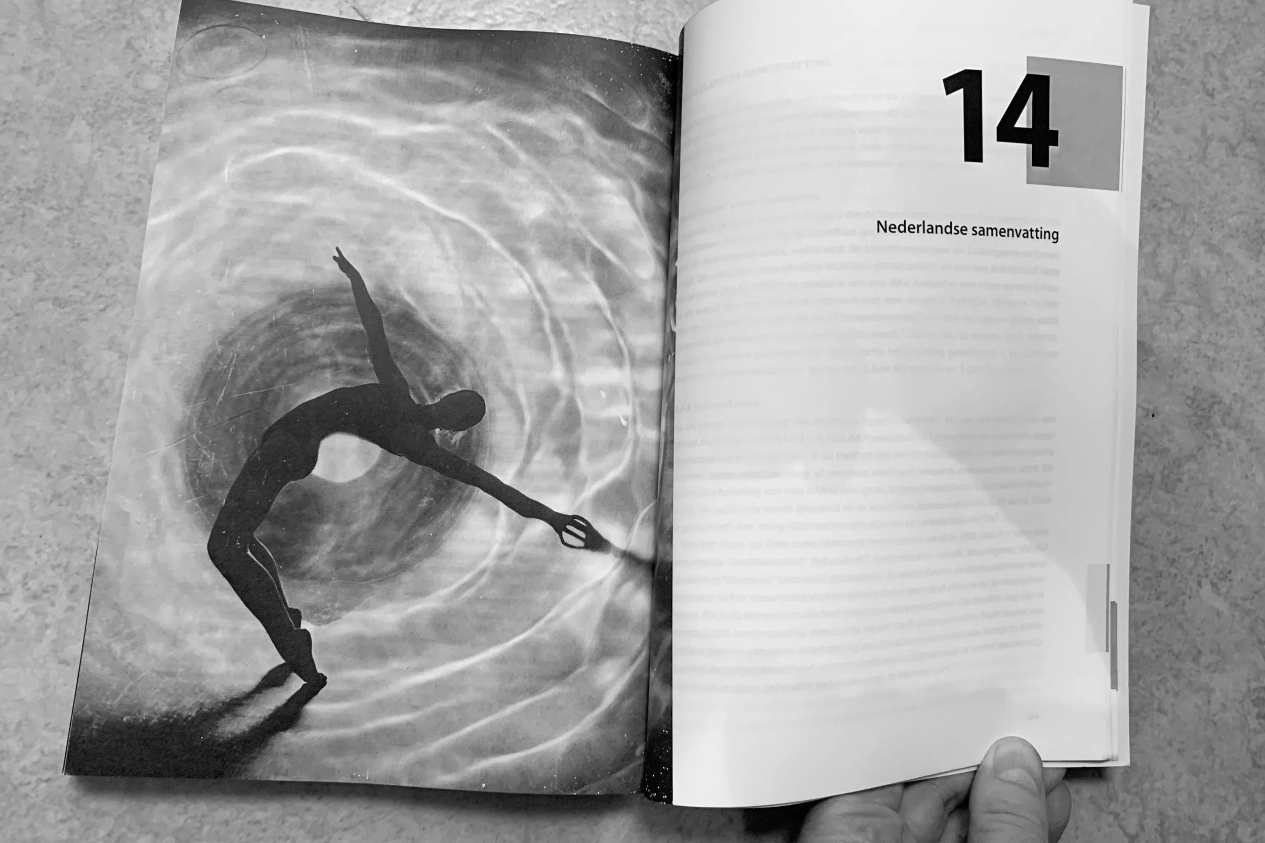

In my artistic work, I enjoy combining the digital and the analogue. I also like drawing inspiration from my artistic practice for commercial assignments—and vice versa. One example is the image below, created for the cover of a PhD thesis on aneurysms (a rupture in a blood vessel). The PhD candidate was also a high-level dancer. After photographing her in a grain silo, I placed a glass oven dish filled with water over the image and re-photographed it while blowing through a straw. The result symbolises the dynamics of blood flow in a vessel and the innovative treatment method she developed. In this way, art and science came together beautifully.
The diversity of assignments regularly pushes me out of my comfort zone, allowing me to keep developing myself—much more so than at the university, actually. It gives me enormous energy, and I feel completely at home doing this work. Hopefully, that’s reflected in your new website as well.
Best of luck with it, and thank you for the inspiring collaboration.”
Van wetenschap naar webdesign
Het creatieve pad van Sander Martens
Het is jullie niet ontgaan, het Landelijk Kennisnetwerk Psychiatrie en Hoogbegaafdheid heeft een nieuw uiterlijk: website, logo, nieuwsbrief; in december zag alles er ineens anders uit. Wij zijn hartstikke trots op dit mooie ontwerp, én op de ontwerper Sander Martens die bereid was hier zijn tijd – ook deels als vrijwilliger- in te steken. Deze inspirerende man, daar willen we graag iets meer over vertellen. Bestuurslid Marije van Beilen belt hem op.
Sander Martens
Ha, Sander. Jij ontwierp ons nieuwe logo en website. Wij vroegen om een website in het bordeauxrood, maar, die hebben we niet gekregen! Leg uit!? 🙂
“Nee, dat klopt” lacht Sander. “Ik ben op zoek gegaan naar een wat passender kleurenpalet voor dit onderwerp. Jullie gaven aan bordeauxrood mooi te vinden, maar wilden ook een zakelijk, professioneel en strak ontwerp gericht op professionals in de GGZ. De kleuren die ik nu gekozen heb zijn een mix waarbij je veel kleur terugziet in de website, zonder echter te druk te worden. Het is clean, en het geeft vertrouwen. Geen bordeauxrood dus, wat je toch wat eerder associeert met een casino, wijnhandel of makelaarskantoor.”
We hebben gevraagd om een website gericht op hoogbegaafde mensen. Speels, beweging, verbinding. Hoe heb je dat vertaald in je design?
“De website moest deskundigheid uitstralen maar ook nieuwsgierigheid opwekken. In de website zit nu veel beweging en zo word je op een natuurlijke manier door de website heen geleid. Vanuit mijn voormalige werk als cognitief neurowetenschapper ben ik veel met de vraag bezig geweest hoe aandacht getrokken wordt en hoe je deze vasthoudt. Die kennis neem ik mee in mijn huidige werk als fotograaf, kunstenaar en webdesigner. Hoe creëer je beeld dat de aandacht trekt, wat is de boodschap die je over wil brengen, wat zijn afleidende factoren?”
Cognitief neurowetenschapper! Ja, dat wist ik natuurlijk, we waren ooit collega’s op de Universiteit in Groningen. Aandacht is een breed begrip dat in veel psychologische en cognitieve disciplines terugkomt. Kun je eens uitleggen, wat bedoel jij dan precies als je ‘aandacht’ zegt?
“Nou, ik onderzocht individuele verschillen in selectieve aandacht: hoe snel neem je dingen op en hoe snel kun je daarna je aandacht weer op iets nieuws richten? Ongeacht intelligentie of opleidingsniveau bleken mensen hier nogal in te verschillen. Die verschillen en veranderingen in aandacht volgden we met EEG en het meten van pupilgrootte - een maat voor mentale belasting.”
Het kleurenpallet van onze nieuwe website
Wat een mooie combinatie van kennis heb je dan: de kennis van de visuele waarneming en aandacht èn de creativiteit van een kunstenaar! Hoe zien wij dit terug in onze website?
“Het klinkt misschien als een grote sprong – van wetenschapper naar kunstenaar – maar beide werelden hebben me gevormd tot wie ik nu ben. Door bijvoorbeeld in Nature te publiceren of lezingen te geven op Harvard en Cambridge heb ik geleerd om complexe ideeën helder en visueel te communiceren.
Kenmerkend aan deze opdracht was de enorme hoeveelheid informatie die jullie al hadden gecreëerd in de eerste jaren van de stichting LKPHB. Jullie bestaande aanbod in kennis, en daarnaast het nieuws en ontwikkelingen over komende gebeurtenissen - denk aan de webinars - is de kern van wat jullie doen. Voor mij was het een mooie uitdaging om dat terug te brengen naar een basis die overzichtelijk blijft voor een websitebezoeker. De bezoeker moet niet verdwalen. Drie knoppen op de nieuwe website – ‘nieuws’, ‘aanbod’, en ‘contact’ – vormen het middel waarmee je de belangrijkste informatie snel kunt bereiken. Het is zo een mooi samenhangend geheel geworden.”
Je hebt naast de website ook een prachtig nieuw logo voor ons ontworpen. In feite was dit vrijwilligerswerk. Ik kan me zo voorstellen dat hoogbegaafdheid geen vreemd thema voor jou is. Heb je zelf iets met de doelgroep?
“Ja, ik heb in mijn omgeving best vaak te maken gehad met hoogbegaafdheid. En, psychische klachten, inderdaad. Op de lagere school had ik bijvoorbeeld een klasgenoot die heel erg worstelde met de eenzaamheid die hij ervoer vanwege het hoogbegaafd zijn. Deze opdracht sprak me daarom meteen erg aan.
We zijn begonnen met het logo. Aanvankelijk gingen we uit van meerdere letters, LKPHB, maar dit hebben we gaandeweg beperkt tot de drie letters P, H en B. Toen werd het makkelijker om er iets visueels van te maken. Waar ik op uit ben gekomen is de letters zo samen te brengen dat ze ook verwijzen naar een ruimtelijk item uit een intelligentietest. Zelf gebruikte ik eerder de Raven’s progressive matrices test in mijn wetenschappelijke onderzoek.”
Ah, ben je dan zelf ook hulpverlener, nam je IQ tests af? Wat heb je eigenlijk een veelzijdige loopbaan.
“Nee, ik ben nooit hulpverlener geweest. Ik heb wel Psychologie en Kunstmatige Intelligentie gestudeerd in Tilburg en Nijmegen, ben afgestudeerd met een stage in Cambridge en heb vervolgens mijn PhD in Leiden gedaan. In Cambridge kocht ik ook mijn eerste camera, dertig jaar geleden.
Ik wilde eigenlijk hoogleraar worden, maar de kans daarop zag ik met de aanhoudende bezuinigingen op het hoger onderwijs steeds kleiner worden. Naast mijn full-time baan begon ik daarom 11 jaar geleden met een eigen fotografiebedrijf. Sinds een jaar of twee werk ik nu volledig als fotograaf en webdesigner. Een hele spannende stap om te nemen, maar daar heb ik tot op heden geen moment spijt van gehad.
Naast wetenschappers en medici bestaat mijn netwerk inmiddels ook uit veel kunstenaars – voor wie ik nu regelmatig websites maak. Verder doe ik veel portretfotografie – waaronder promoties - maar ook dingen zoals architectuur- en productfotografie. Ik geef workshops en verkoop artistiek werk via galeries en mijn eigen website (www.sandermartens.com).
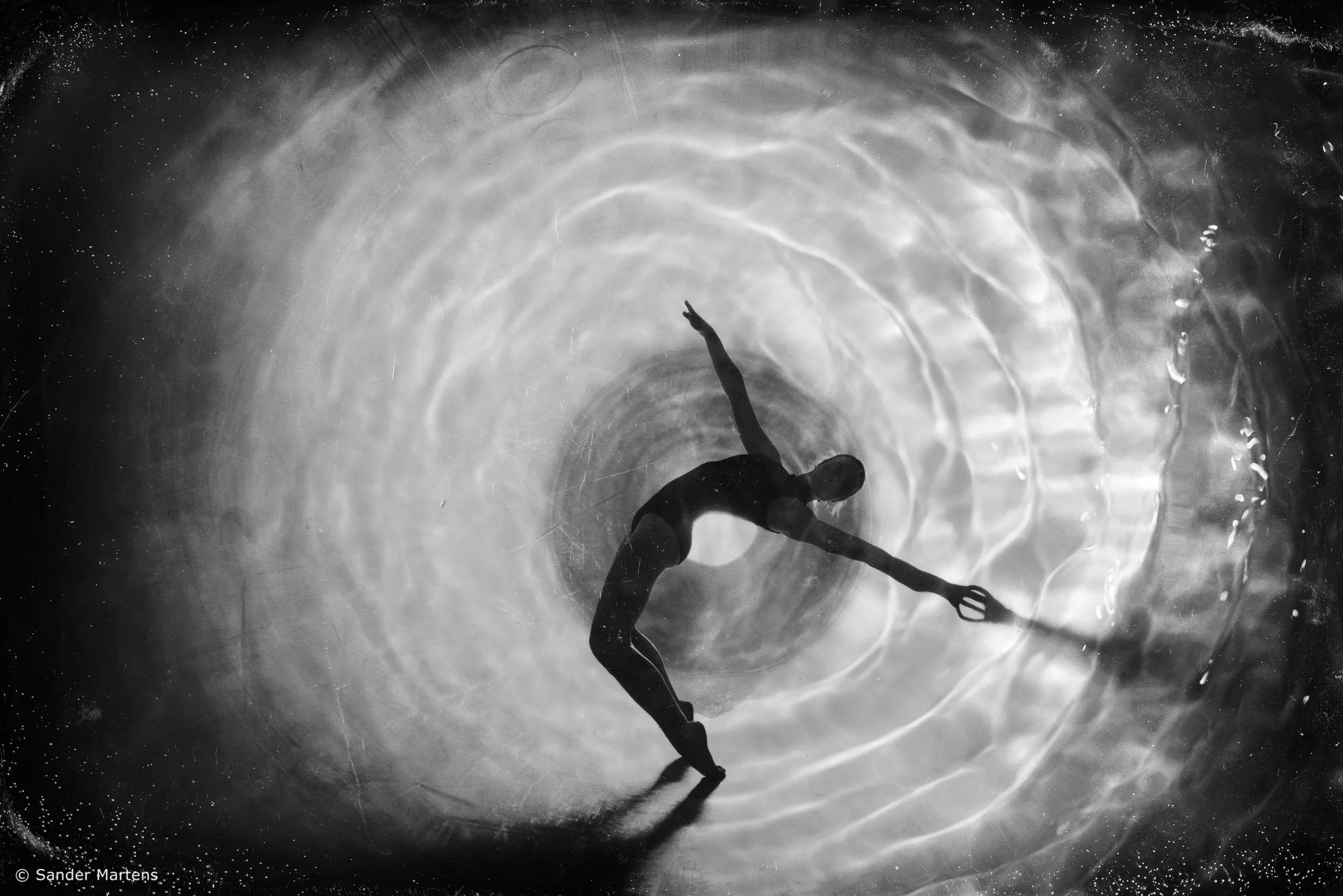

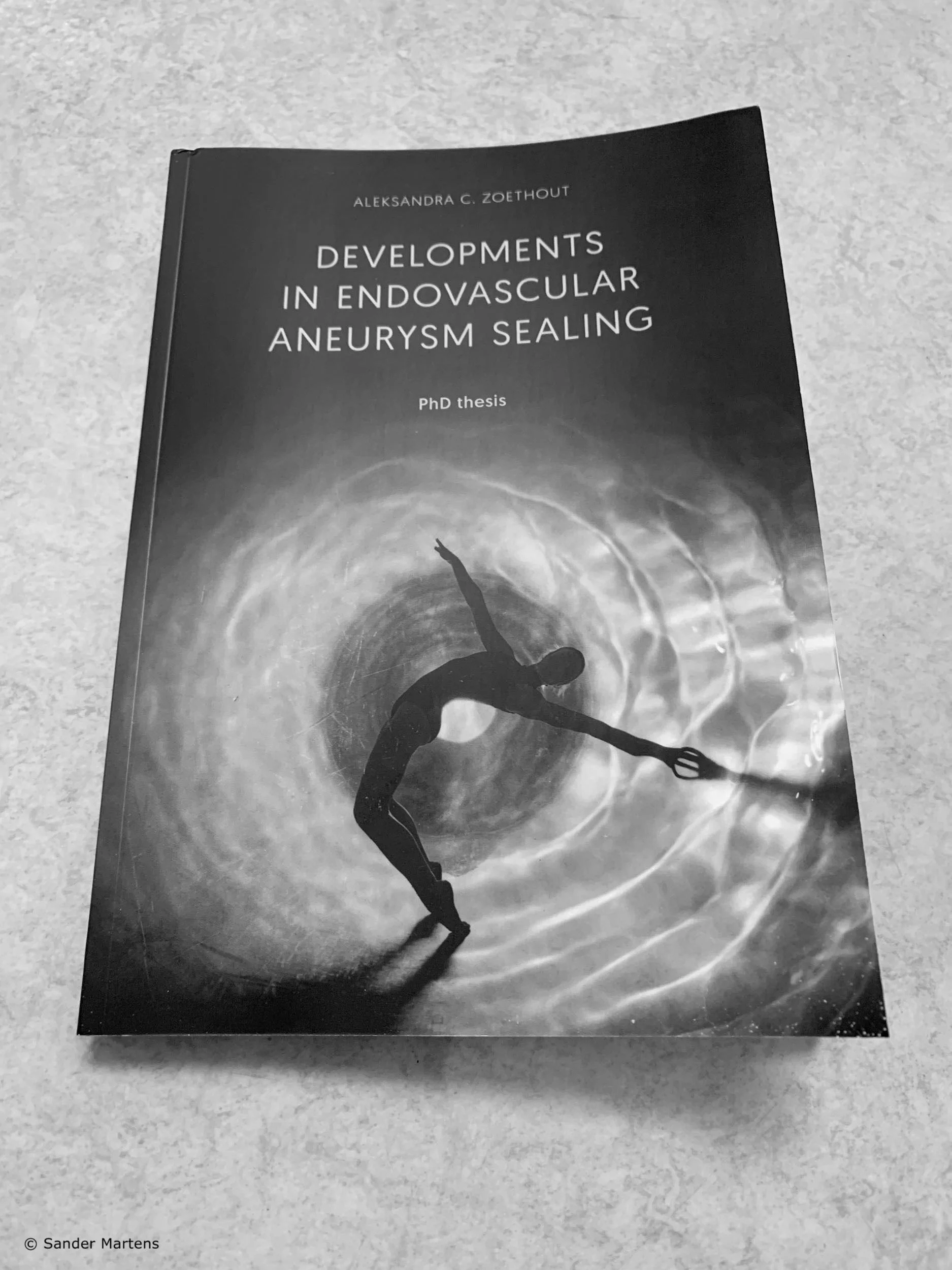


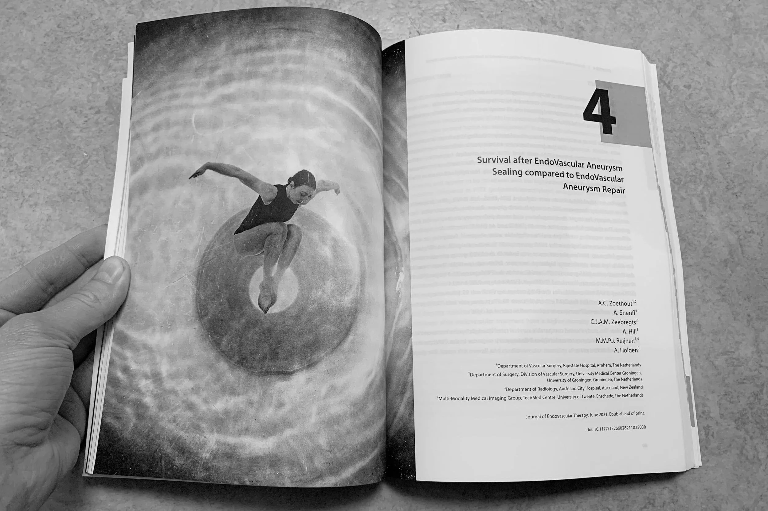
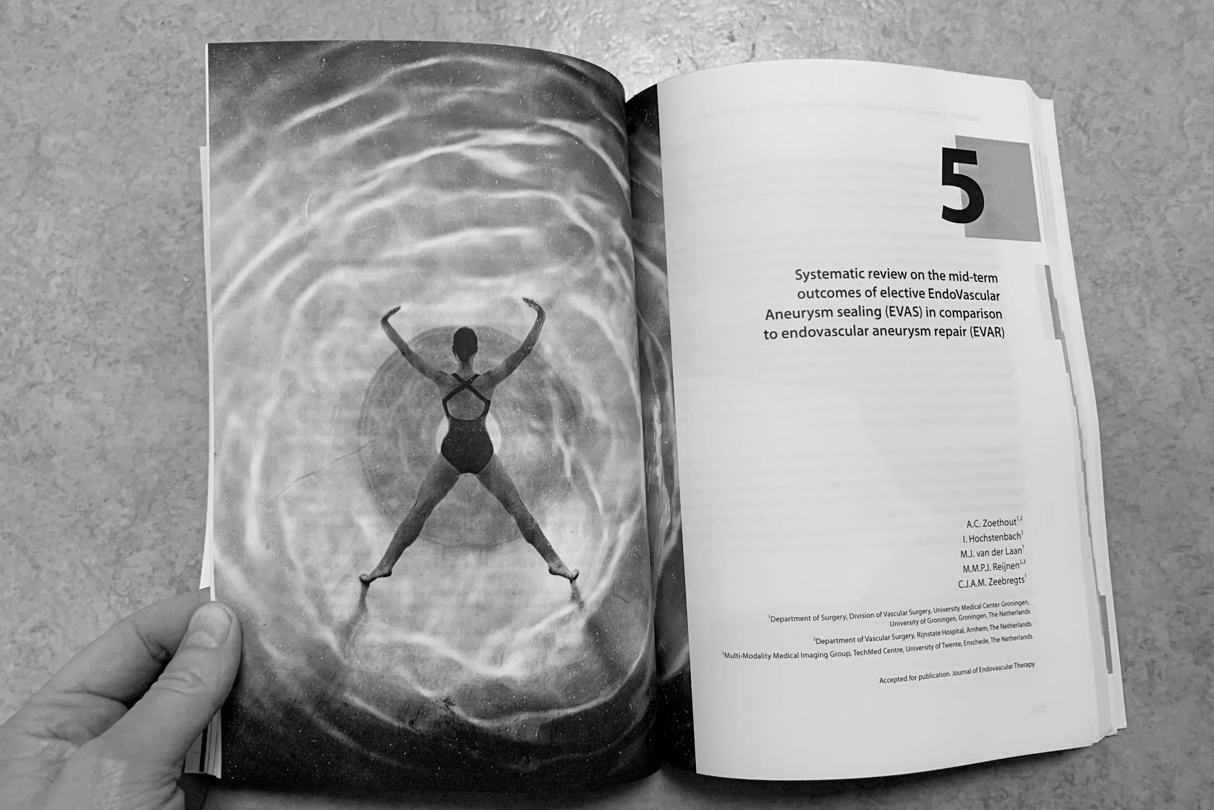
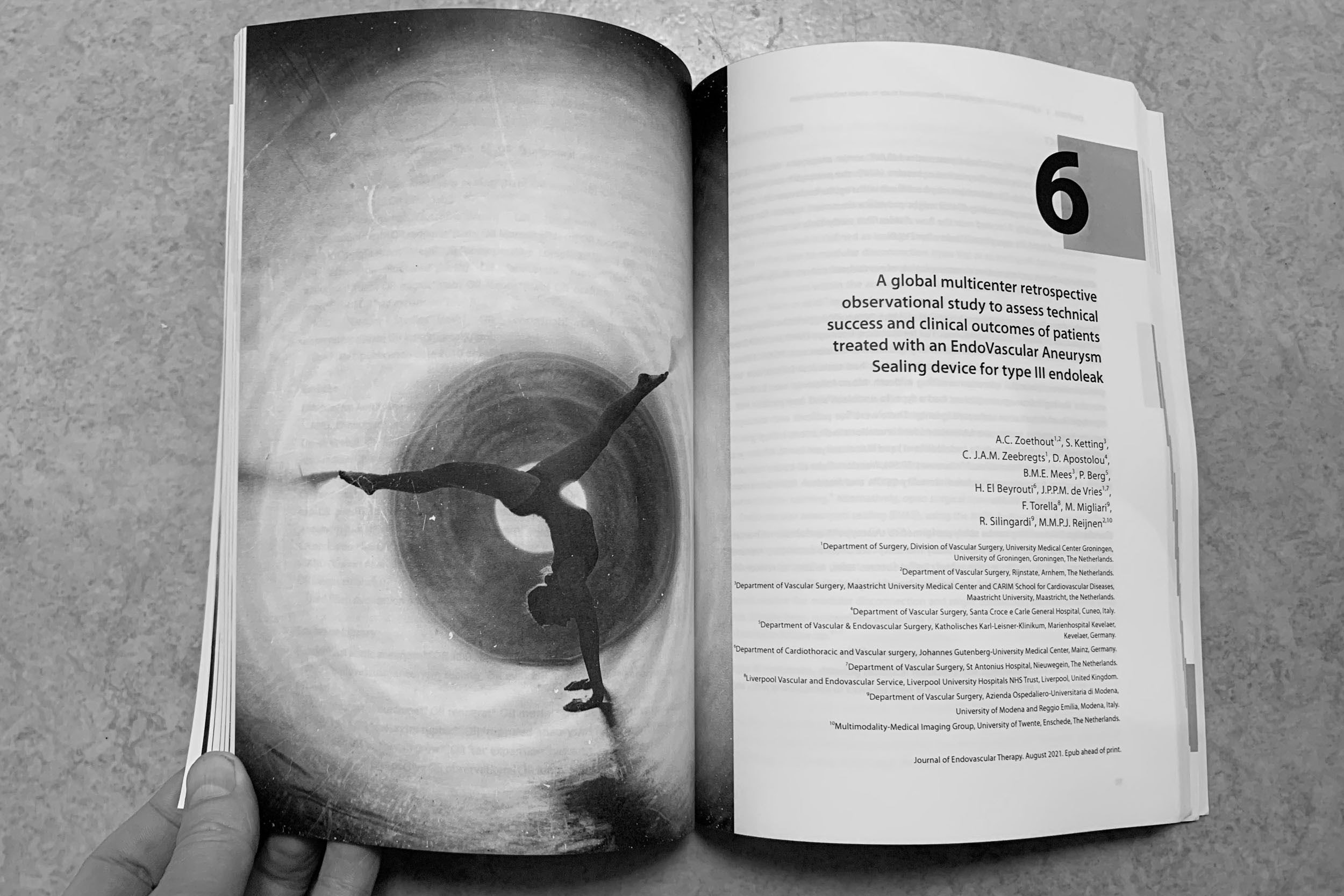
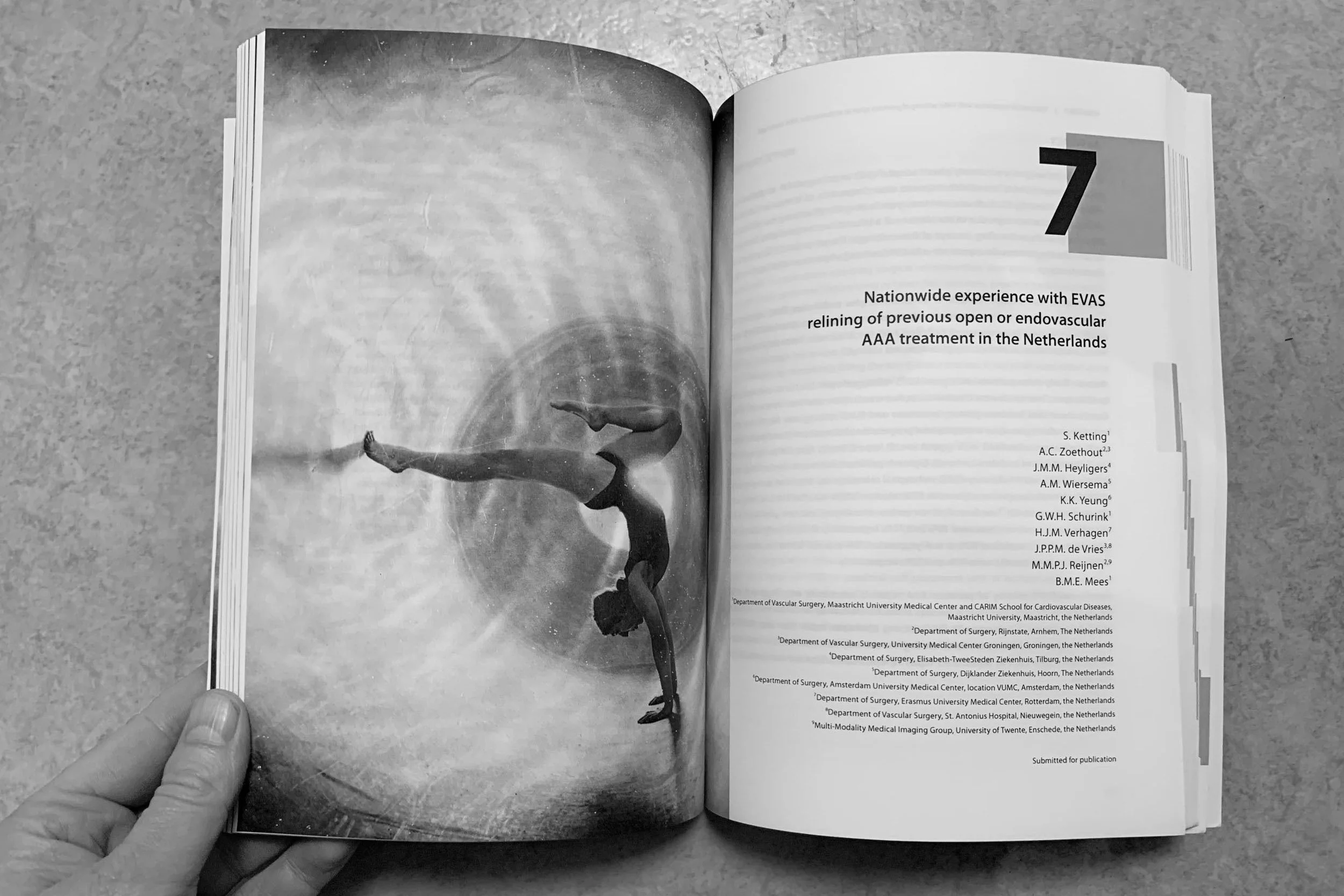


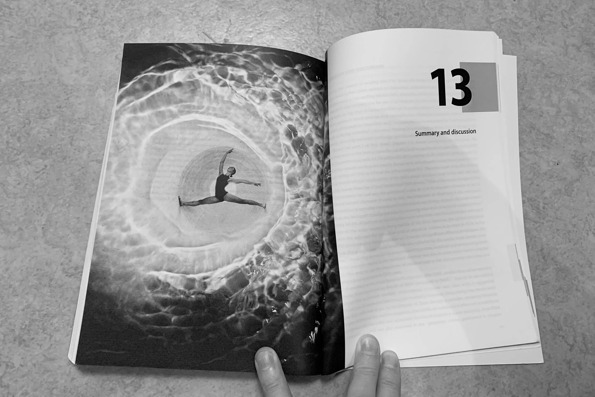

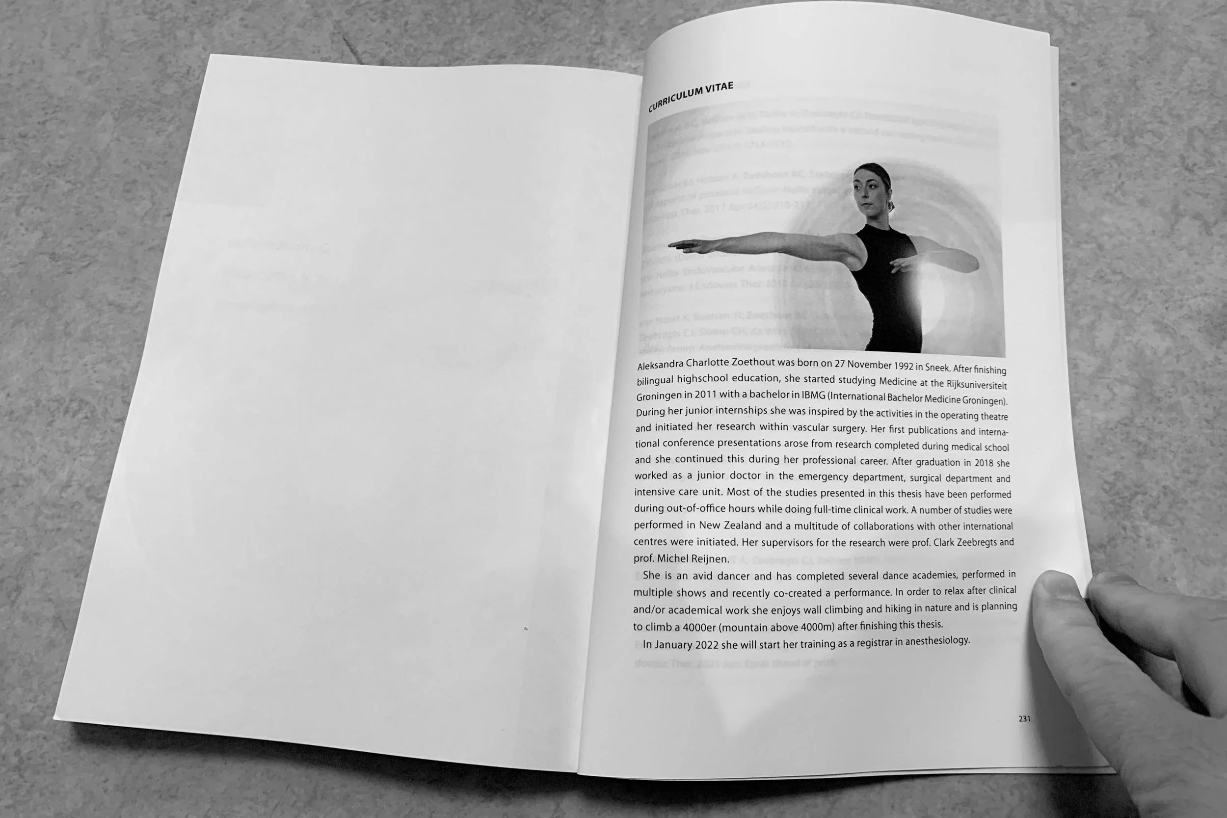
In mijn artistieke werk hou ik ervan om het digitale met het analoge te combineren. En ik vind het leuk om voor commerciële opdrachten inspiratie te halen uit mijn artistieke werk – en andersom. Een voorbeeld is onderstaand beeld voor de cover van een proefschrift over aneurysma’s (een scheur in het bloedvat). De betreffende promovendus kon tevens op hoog niveau dansen. Nadat ik haar had gefotografeerd in een graansilo heb ik een glazen ovenschaal gevuld met water op de foto geplaatst en dat – al blazend op een rietje – opnieuw gefotografeerd. Het geheel symboliseert de dynamiek van het bloed in een bloedvat en de innovatieve behandelingsmethode die ze had ontwikkeld. Zo kwamen kunst en wetenschap heel mooi samen.
De diversiteit van de opdrachten trekt me regelmatig uit mijn comfortzone, waardoor ik mezelf continu blijf ontwikkelen – eigenlijk veel meer dan op de universiteit. Ik krijg er dan ook enorm veel energie van en voel me als een vis in het water. Hopelijk zie je dat ook terug in jullie nieuwe website.
Heel veel succes ermee en bedankt voor de creatieve samenwerking.”