Who's afraid of red, yellow, and blue?
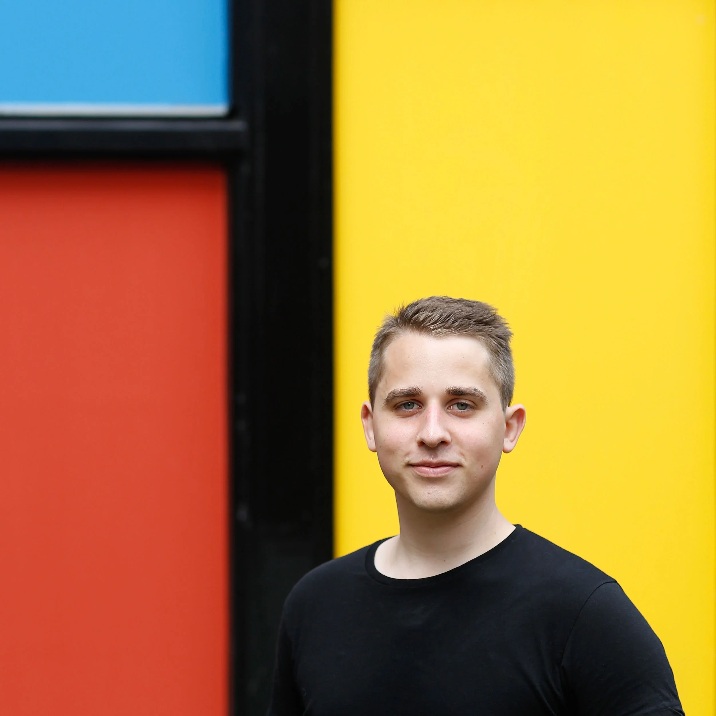
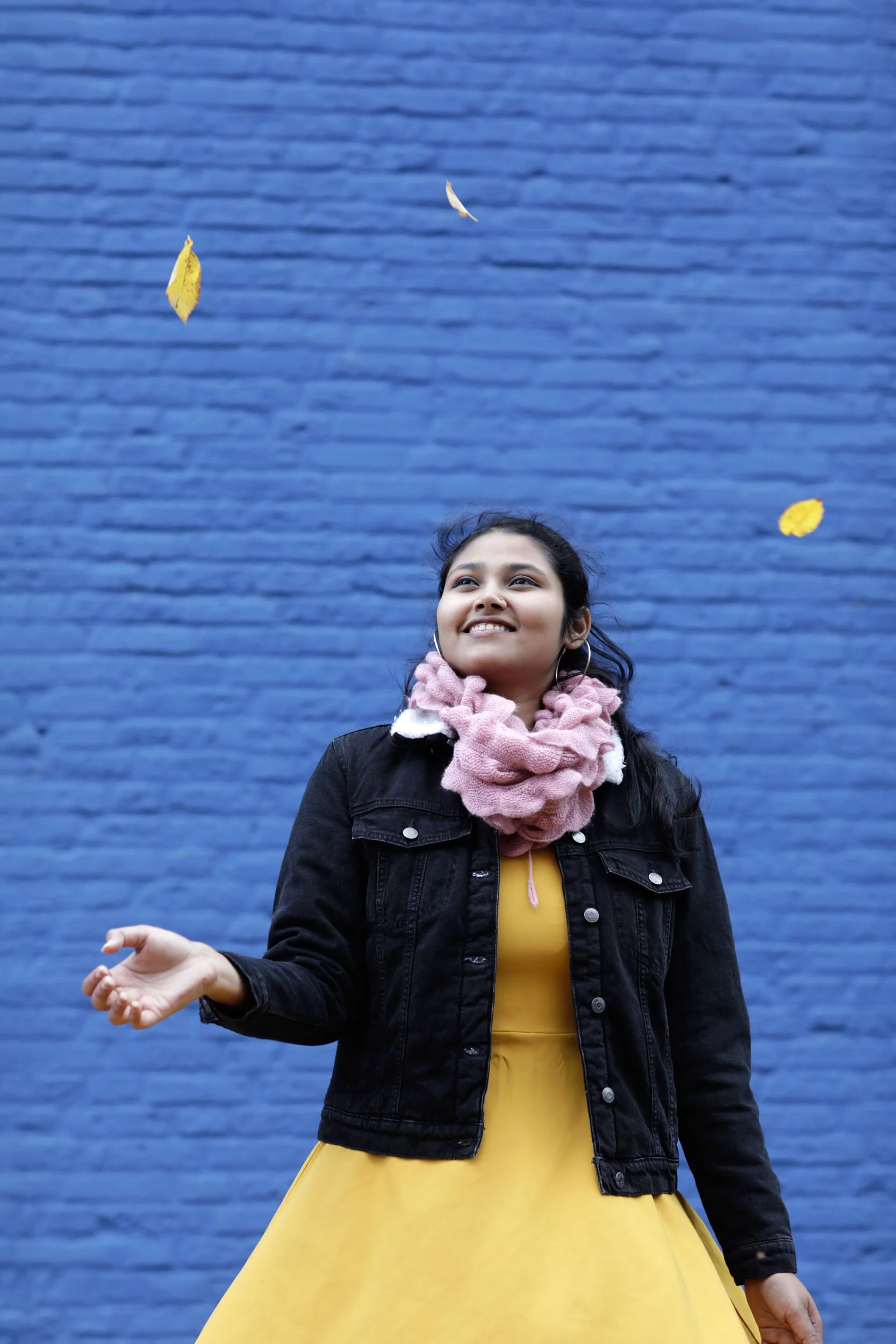
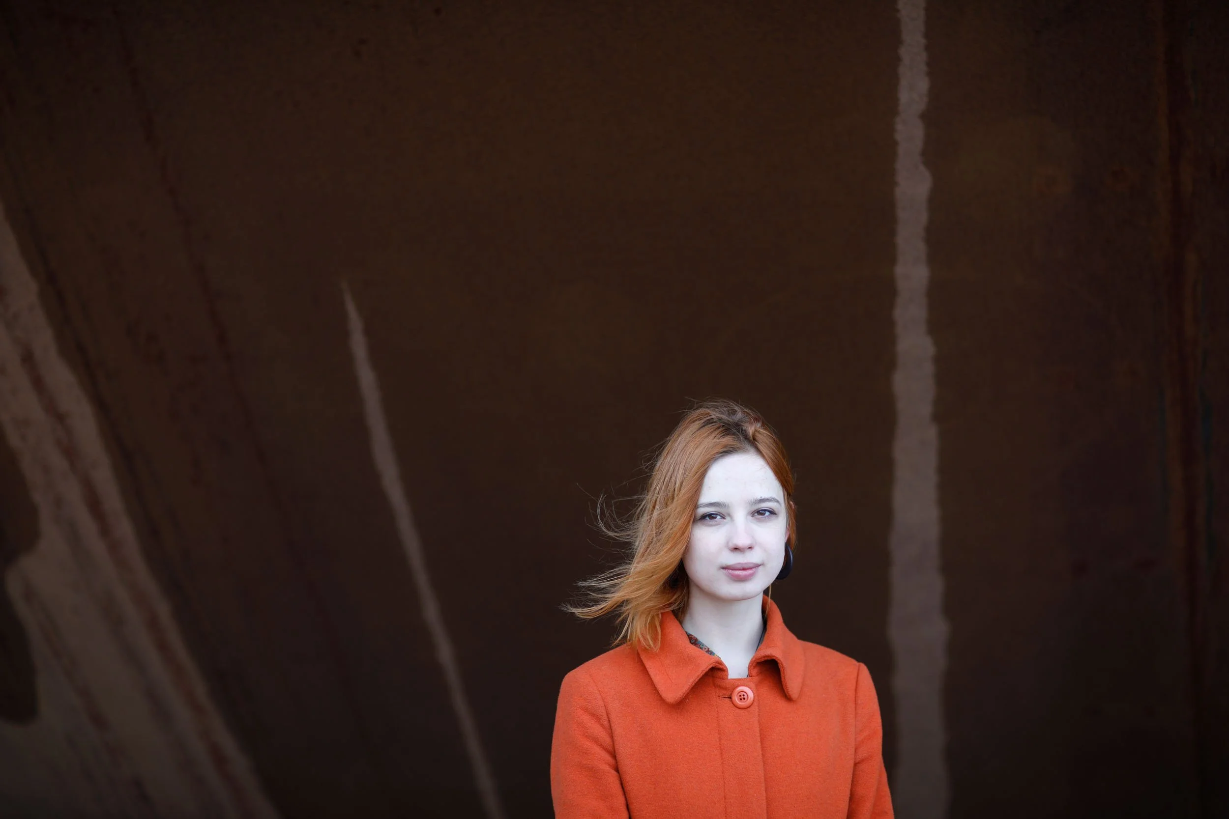
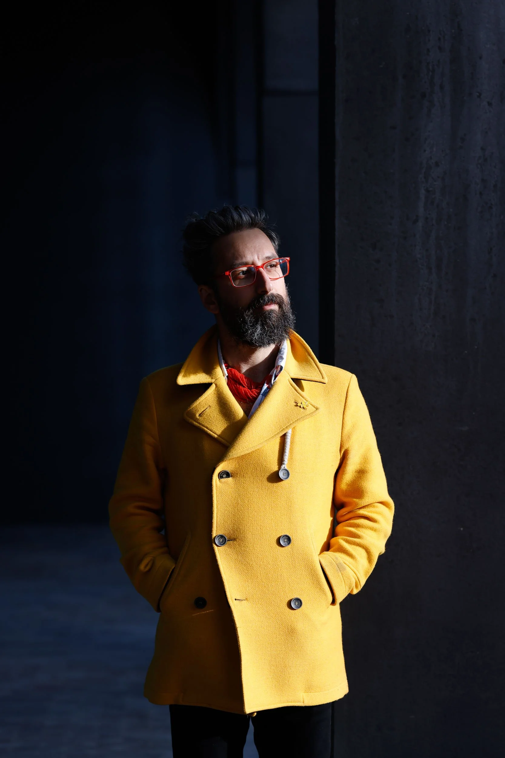
Click on an image to enlarge…The Power of Colour: A New Perspective on Portrait Photography
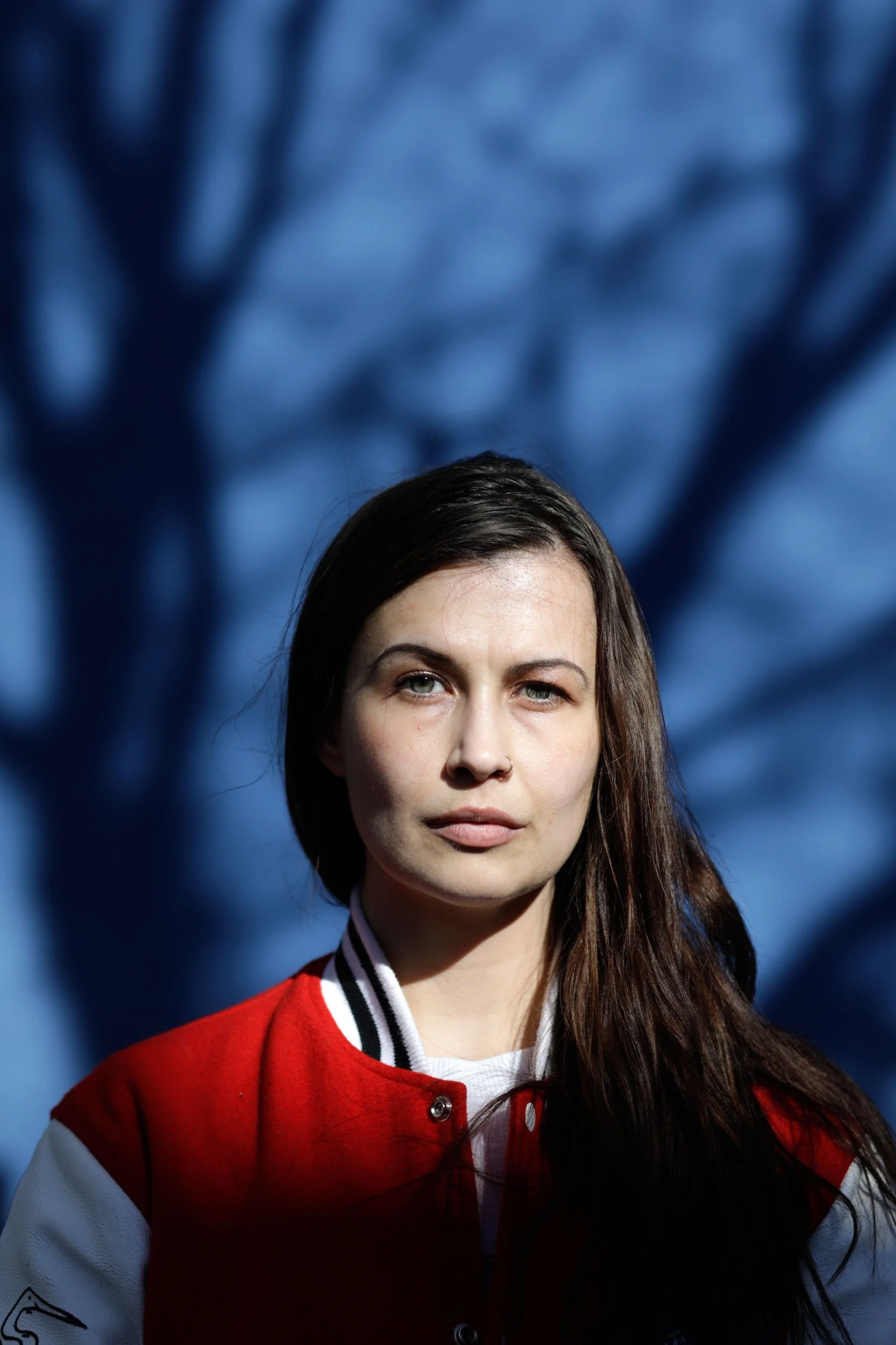
Ever since I first encountered Stephan Vanfleteren's black and white photography, I have a deep love for monochrome imagery. The abstraction that emerges when you remove colour directly emphasizes form, texture, and emotion. Today, however, I want to share a different aspect of my work that I'm increasingly drawn to: portrait photography - in colour.
Why Colour?
While black and white photography has become my signature style, colour possesses an undeniable power that sometimes is exactly what a portrait needs. As I take on more commercial assignments, I find myself using colour more frequently, but I'm also discovering moments in personal projects where colour enhances the essence of the image.
The Technical Side
Unlike black and white photography, where contrast and tonal values play the leading role, colour photography demands a different approach. Colour harmony, temperature, and saturation become crucial elements in the composition. Nevertheless, I remain faithful to my minimalist style – colours should support the story, not dominate it.
A New Direction?
Does this signal a new direction in my work? Not exactly. Black and white remains my first love and primary form of expression. However, these colour portraits represent a growing openness to choosing the right medium for each specific story I want to tell.
For now, you'll mainly find colour in my commissioned work. Nevertheless curious to see my black and white portraits? You can find them here!
De kracht van kleur: een nieuwe kijk op portretfotografie
Sinds ik de zwart-wit fotografie van Stephan Vanfleteren voor het eerst zag heb ik een grote liefde voor zwart-wit fotografie. De abstractie die ontstaat wanneer je kleur wegneemt legt rechtstreeks de nadruk op vorm, textuur en emotie. Vandaag wil ik echter een andere kant van mijn werk laten zien waar ik hoe langer hoe meer naar toe beweeg. Die van de portretfotografie - in kleur.
Waarom kleur?
Hoewel zwart-wit fotografie mijn signatuur is geworden heeft kleur een onmiskenbare kracht die soms precies is wat een portret nodig heeft. Naarmate ik steeds meer commerciële opdrachten doe gebruik ik kleur steeds vaker, maar ook in persoonlijke projecten ontdek ik steeds vaker momenten waar kleur de essentie van het beeld versterkt.
De technische kant
Anders dan bij zwart-wit fotografie, waar contrast en toonwaarden de hoofdrol spelen, vraagt kleurenfotografie om een andere benadering. Kleurharmonie, temperatuur en verzadiging worden cruciale elementen in de compositie. Wel blijf ik trouw aan mijn minimalistische stijl – de kleuren moeten het verhaal ondersteunen, niet overheersen.
Een nieuwe richting?
Betekent dit een nieuwe richting in mijn werk? Niet direct. Zwart-wit blijft mijn eerste liefde en primaire uitdrukkingsvorm. Maar deze kleurenportretten representeren wel een groeiende openheid om het juiste medium te kiezen voor elk specifiek verhaal dat ik wil vertellen.
Voorlopig vind je kleur vooral terug in mijn commerciële werk. Toch ook benieuwd naar mijn zwart-wit portretten? Die vind je hier!